
- Lit とは
- Web Components
- Lit による最小限の Web Components
- Lit プロジェクトの準備
- my-element コンポーネントの作成
- ビルドと実行
- 宣言型イベントリスナー
- まとめ
Lit とは
Google の Chrome チームにより始まった Polymer -> LitElement -> Lit と変遷した web components ベースのフロントエンドUIフレームワークです(LitElement 3.0 == Lit )。
Lit is a simple library for building fast, lightweight web components.
と謳われる通り、Web Components 構築用の軽量なライブラリになります。
Polymer は、Web Components の Polyfill ライブラリでしたが、現在のモダンブラウザでは Web Components がネイティブで利用可能となったため、Web Components をより簡単に開発することにフォーカスしたものとなっています。
ロゴがダサいのが欠点でしょうか。
Web Components
Web Componentsの概念は、2011年にChrome開発者の Alex Russell により初めて紹介され、 10年かけて対応するブラウザ環境も整い、広く採用されつつある技術です。
Web Components により、規定のHTMLタグに加え、独自に定義したコンポーネント(タグ)をネイティブに利用できるようになります。
そして、このコンポーネントは、独立してカプセル化されるため、React や Vue といった各種フロントエンドフレームワークと合わせて使うことができます。
移り変わりの激しいフロントエンドの世界で、ネイティブサポートされる安定性の高いAPIの元で開発を行えることが大きな利点となるでしょう。
Web Components の詳細は以下に詳しいです。
https://developer.mozilla.org/ja/docs/Web/Web_Components
MDN から抜粋すると、Web Components は以下の要素から構成されます。
- カスタム要素
- カスタム要素とその動作を定義するための、一連の JavaScript API。以降、ユーザーインターフェイスの中で好きなだけ使用することができます。
- シャドウ DOM
- カプセル化された「シャドウ」 DOM ツリーを要素に紐付け、関連する機能を制御するための、一連の JavaScript API です。シャドウ DOM ツリーは、メイン文書の DOM とは別にレンダリングされます。こうして、要素の機能を公開せずに済み、文書の他の部分との重複を恐れることなく、スクリプト化やスタイル化できます。
- HTML テンプレート
<template>と<slot>要素によって、レンダリングされたページ内に表示されないマークアップのテンプレートを書くことができます。カスタム要素の構造体の基礎として、それらを何度も再利用できます。
WEBCOMPONENTS.ORG のドキュメントも参考になるでしょう。
Lit による最小限の Web Components
Lit で定義する Web Components の最も単純な例は以下のようになります。
<!DOCTYPE html>
<html>
  <head>
    <meta charset="utf-8" />
    <title>Lit Demo</title>
    <script type="module">
      import {LitElement, html} from 'https://cdn.jsdelivr.net/gh/lit/dist@2/core/lit-core.min.js';

      export class MyElement extends LitElement {
        static properties = {
          name: {},
        };

        constructor() {
          super();
          this.name = 'Lit';
        }

        render() {
          return html`
          <h2>Welcome to the ${this.name}</h2>
          `;
        }
      }
      customElements.define('my-element', MyElement);
    </script>
  </head>
  <body>
    <my-element>
      <p>This is child content</p>
    </my-element>
  </body>
</html>
<script type="module"> で LitElement を継承したクラスを定義し、customElements.define('my-element', MyElement); で Web Components として定義しています。
LitElement は、ReactiveElement を介して HTMLElement からの継承関係となっています。
export class LitElement extends ReactiveElement {
  // ...
}
export abstract class ReactiveElement
  extends HTMLElement
  implements ReactiveControllerHost {
  // ...
}
my-element として定義したコンポーネントは、<my-element></my-element> として利用できます。
このファイルを index.html として保存してブラウザで表示すると以下のようになります。

DOMは以下のように <my-element></my-element> 要素が shadow-root となり、シャドウ DOM として他の要素とは独立してレンダリングされます。

ここまでは、JavaScript による例でしたが、通常は TypeScript を使うハズなので、続けて見ていきましょう。
Lit プロジェクトの準備
Lit のスターターは以下で公開されています。
しかしここでは、最小限のサンプルとして、一からプロジェクトを作成していくことにします。
プロジェクトを npm init で作成します。
$ mkdir example
$ cd example
$ npm init -y
開発用のパッケージを3つと、Lit 自身を導入します。
$ npm install -D typescript @web/dev-server rimraf
$ npm install lit
この時点で package.json は以下のようになります。
{
  "name": "example",
  "version": "1.0.0",
  "description": "",
  "main": "index.js",
  "scripts": {
    "test": "echo \"Error: no test specified\" && exit 1"
  },
  "keywords": [],
  "author": "",
  "license": "ISC",
  "devDependencies": {
    "@web/dev-server": "^0.1.34",
    "rimraf": "^3.0.2",
    "typescript": "^4.8.3"
  },
  "dependencies": {
    "lit": "^2.3.1"
  }
}
スクリプトなどを追加して、以下のように更新しておきます。
{
  "name": "example",
  "version": "1.0.0",
  "description": "",
  "main": "my-element.js",
  "module": "my-element.js",
  "type": "module",
  "scripts": {
    "build": "tsc",
    "build:watch": "tsc --watch",
    "serve": "wds --node-resolve --watch --open",
    "clean": "rimraf dist",
    "test": "echo \"Error: no test specified\" && exit 1"
  },
  "keywords": [],
  "author": "",
  "license": "ISC",
  "devDependencies": {
    "@web/dev-server": "^0.1.34",
    "rimraf": "^3.0.2",
    "typescript": "^4.8.3"
  },
  "dependencies": {
    "lit": "^2.3.1"
  }
}
tsconfig.json を以下のように作成します。
$ touch tsconfig.json
{
  "compilerOptions": {
    "target": "es2019",
    "module": "es2020",
    "lib": ["es2020", "DOM", "DOM.Iterable"],
    "declaration": true,
    "declarationMap": true,
    "sourceMap": true,
    "inlineSources": true,
    "outDir": "./dist",
    "rootDir": "./src",
    "strict": true,
    "noUnusedLocals": true,
    "noUnusedParameters": true,
    "noImplicitReturns": true,
    "noFallthroughCasesInSwitch": true,
    "noImplicitAny": true,
    "noImplicitThis": true,
    "moduleResolution": "node",
    "allowSyntheticDefaultImports": true,
    "experimentalDecorators": true,
    "forceConsistentCasingInFileNames": true,
    "noImplicitOverride": true
  },
  "include": ["src/**/*.ts"],
  "exclude": []
}
my-element コンポーネントの作成
プロジェクトの準備ができたので、カスタム要素を作成していきましょう。
$ mkdir src
$ touch src/my-element.ts
TypeScript ではデコレータを使って以下のように書くことができます。
import {LitElement, html} from 'lit';
import {customElement, property} from 'lit/decorators.js';

@customElement('my-element')
export class MyElement extends LitElement {
  @property()
  name = 'Lit';

  override render() {
    return html`
    <h2>Welcome to the ${this.name}</h2>
    `;
  }
}
@customElement デコレータで名前を指定してカスタム要素を登録できます。
@property デコレーターでは、リアクティブ・プロパティを定義しています。リアクティブ・プロパティでは、プロパティの更新により、コンポーネントの更新がトリガされます。
最後にカスタム要素を表示する index.html を作成します。
$ touch index.html
<!DOCTYPE html>
<html>
  <head>
    <meta charset="utf-8" />
    <title>Lit Demo</title>
    <script type="module" src="./dist/my-element.js">
    </script>
  </head>
  <body>
    <my-element>
      <p>This is child content</p>
    </my-element>
  </body>
</html>
ビルドと実行
$ npm run build
$ npm run serve
ブラウザが立ち上がり以下のようになります。
このように、TypeScript ではデコレータを使ってとても簡単にカスタム要素を作成することができます。
宣言型イベントリスナー
最後に、イベントについて触れておきましょう。
src/my-element.ts を以下のように変更します。
import {LitElement, html, css} from 'lit';
import {customElement, property} from 'lit/decorators.js';

@customElement('my-element')
export class MyElement extends LitElement {

  static override styles = css`p { color: navy }`;

  @property()
  name: string = 'Your name here';

  override render() {
    return html`
      <p>Hello, ${this.name}</p>
      <input @input=${this.changeName} placeholder="Enter your name">
    `;
  }

  changeName(event: Event) {
    const input = event.target as HTMLInputElement;
    this.name = input.value;
  }
}
先程の例との違いは、html テンプレート中に @input テンプレート式でイベントリスナーを登録している点です。テンプレートがレンダリングされると、 @ 式で定義した宣言型のイベントリスナーが追加されます。
入力イベントにより、イベントハンドラである changeName(event: Event) {} メソッドが実行され、name プロパティの値が更新されます。
name プロパティはリアクティブ・プロパティであるため、変更によりコンポーネントの更新がトリガされます。
また、styles クラスフィールドでこのコンポーネントに閉じたスタイル定義をしている点にも注意してください。
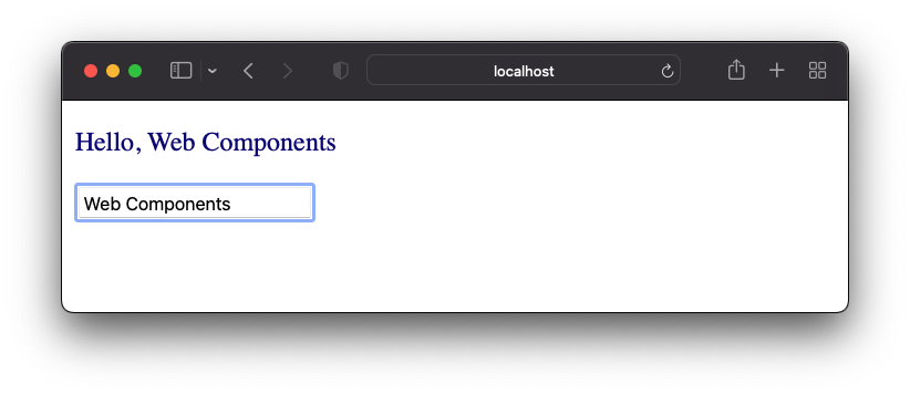
これを実行すると以下のようになり、テキストボックスへの入力がリアクティブに画面反映されます。
まとめ
Web Components ライブラリの Lit についての簡単な紹介を行いました。
次回はもう少し詳細について紹介していく予定です。