
pico とは
- シンプルで小さなCSS
- 2019年12月に v1 リリース
- 2024年02月に v2 リリース
- クラスレス版を使えば、プレーンなHTMLにスタイル適用できる
- リポジトリ
以下のようなプレーンなHTMLファイルで、
<!doctype html>
<html lang="en" data-theme="light">
  <head>
    <meta charset="utf-8" />
    <meta name="viewport" content="width=device-width, initial-scale=1" />
    <meta name="color-scheme" content="light dark" />
    <link
      rel="stylesheet"
      href="https://cdn.jsdelivr.net/npm/@picocss/pico@2/css/pico.classless.min.css"
    />
    <title>pico css</title>
  </head>
  <body>
    <main>
      <h1>Form</h1>

      <form>
        <fieldset>
          <label>
            First name
            <input
              name="first_name"
              placeholder="First name"
              autocomplete="given-name"
            />
          </label>
          <label>
            Email
            <input
              type="email"
              name="email"
              placeholder="Email"
              autocomplete="email"
            />
          </label>
        </fieldset>
        <input
          type="submit"
          value="Subscribe"
        />
      </form>

      <br/>
      <h1>Table</h1>
      <table>
        <thead>
          <tr>
            <th scope="col">Planet</th>
            <th scope="col">Diameter (km)</th>
            <th scope="col">Distance to Sun (AU)</th>
          </tr>
        </thead>
        <tbody>
          <tr>
            <th scope="row">Mercury</th>
            <td>4,880</td>
            <td>0.39</td>
          </tr>
          <tr>
            <th scope="row">Venus</th>
            <td>12,104</td>
            <td>0.72</td>
          </tr>
        <tfoot>
          <tr>
            <th scope="row">Average</th>
            <td>9,126</td>
            <td>0.91</td>
          </tr>
        </tfoot>
      </table>
    </main>
  </body>
</html>
以下のように表示されます。

バージョン
pico css では、class でスタイルを指定するレギュラー版、クラス指定なしでセマンティックにスタイルを適用するクラスレス版、テーマカラー別などの組み合わせで、様々なバージョンのCSSがCDN提供されています。
例えば、レギュラー版は以下のように指定できますし、
<link
  rel="stylesheet"
  href="https://cdn.jsdelivr.net/npm/@picocss/pico@2/css/pico.min.css"
/>
クラスレス版の fluid レイアウト、テーマカラーRedの場合は以下のように指定できます。
<link
  rel="stylesheet"
  href="https://cdn.jsdelivr.net/npm/@picocss/pico@2/css/picofluid.classless.red.min.css"
/>
以下の書式で、[] 内をオプション指定することで、異なるバージョンが利用できます。
pico[.classless|fluid.classless][.conditional][.red].min.css
.classlessを指定した場合、クラスレス版となり、<main class="container">ではなく、<main>のようにclass定義が不要なバージョンとなる。fluid.classlessを指定した場合、クラスレスなfluidレイアウト(full-width なコンテナ)(.classlessはビューポートに応じた中央配置)となる。.conditionalを指定した場合、class="pico"と指定した配下に対してのみスタイルが適用される。.redのようにカラーテーマを指定できる。カラーは以下を指定できる。red,pink,fuchsia,purple,violet,indigo,blue,無指定(azure),cyan,jade,green,lime,yellow,amber,pumpkin,orange,sand,grey,zinc,slate
カラーテーマは以下のような配色として定義されています。
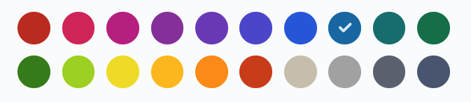
チェックが付いている azure がデフォルトです。
カラースキーム
デフォルトは light で、ダークモードが有効な場合は自動で dark となります。
明示的に指定する場合は、data-theme で指定します。
<html data-theme="light">

</html>
HTML 要素に対して個別に指定する場合は以下のようになります。
<article data-theme="dark">.
コンテナ
クラス指定する場合は .container で指定します。
<body>
  <main class="container">
    ...
  </main>
</body>
定義済みのブレークポイントに応じた固定幅のコンテナが中央に配置されます。
全幅のコンテナは .container-fluid で指定します。
<body>
  <main class="container-fluid">
    ...
  </main>
</body>
クラスレス版の場合は、pico.classless.min.css か pico.fluid.classless.min.css を使うことで、クラス指定無しで自動でコンテナが適用されます。
カラー
pico css で定義されたカラーユーティリティが提供されています。
<link
  rel="stylesheet"
  href="https://cdn.jsdelivr.net/npm/@picocss/pico@2/css/pico.colors.min.css"
/>
以下のようにカラー指定できます。
<h1 class="pico-color-pink-500">Pink title</h1>
彩度は 50 から 950 まで 50 刻みの 19 段階があります。
テーマカラーと同じくred, pink, fuchsia, purple, violet, indigo, blue, azure, cyan, jade, green, lime, yellow, amber, pumpkin, orange, sand, grey, zinc, slate が利用できます。
グリッド
シンプルな Grid が提供されています。.grid を指定します(クラスレス版では使用できません)。
<!doctype html>
<html lang="en" data-theme="light">
  <head>
    <meta charset="utf-8" />
    <meta name="viewport" content="width=device-width, initial-scale=1" />
    <meta name="color-scheme" content="light dark" />
    <link rel="stylesheet" href="https://cdn.jsdelivr.net/npm/@picocss/pico@2/css/pico.min.css" />
    <link rel="stylesheet" href="https://cdn.jsdelivr.net/npm/@picocss/pico@2/css/pico.colors.min.css"/>
    <title>pico css</title>
  </head>
  <body>
    <main class="container">
      <h1>Grid</h1>
      <div class="grid">
        <div class="pico-background-pink-50">1</div>
        <div class="pico-background-fuchsia-50">2</div>
        <div class="pico-background-purple-50">3</div>
        <div class="pico-background-violet-50">4</div>
      </div>
    </main>
  </body>
</html>
以下のようになります。

各種コンテンツ
Heading group
<hgroup>
  <h2>Get inspired with CSS</h2>
  <p>How to use CSS to add glam to your Website?</p>
</hgroup>

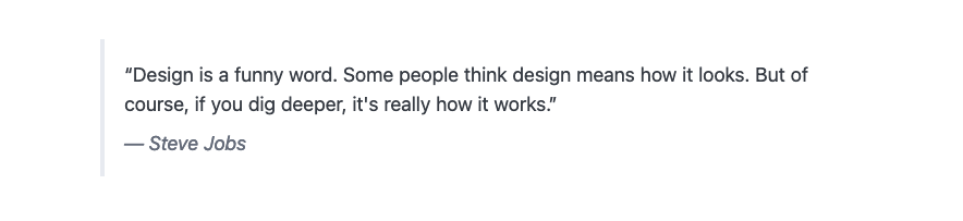
Blockquote
<blockquote>
  “Design is a funny word. Some people think
  design means how it looks. But of course, if
  you dig deeper, it's really how it works.”
  <footer>
    <cite>— Steve Jobs</cite>
  </footer>
</blockquote>
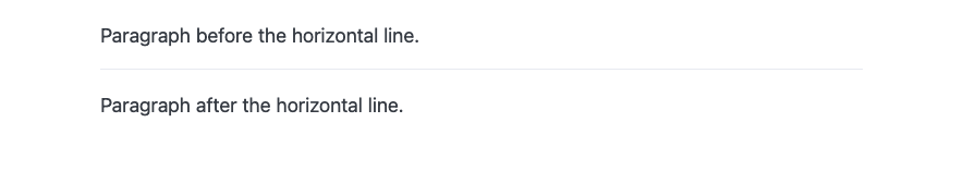
Hr
<p>Paragraph before the horizontal line.</p>
<hr />
<p>Paragraph after the horizontal line.</p>
テキスト
<abbr>Abbr</abbr>
<mark>Mark</mark>
<b>Bold</b>
<s>Strikethrough</s>
<i>Italic</i>
<u>Underline</u>
Text<sub>Sub</sub>
Text<sup>Sup</sup>
<del>Deleted</del>
<ins>Inserted</ins>
<kbd>Ctrl + C</kbd>

リンク
<p><a href="#">Primary</a></p>
<p><a href="#" class="secondary">Secondary</a></p>
<p><a href="#" class="contrast">Contrast</a></p>
</hr>
<p><a href="#">Regular link</a></p>
<p><a href="#" aria-current="page">Active link</a></p>

ボタン
<p>
  <button>Button</button>
  <button class="secondary">Secondary</button>
  <button class="contrast">Contrast</button>
</p>
</hr>
<p>
  <button class="outline">Primary</button>
  <button class="outline secondary">Secondary</button>
  <button class="outline contrast">Contrast</button>
</p>
</hr>
<p>
  <input type="button" value="Input" />
  <input type="reset" />
</p>
</hr>
<p>
  <button disabled>Disabled</button>
  <button class="secondary" disabled>Disabled</button>
  <button class="contrast" disabled>Disabled</button>
</p>
</hr>
<p>
  <div role="button" tabindex="0">Div as a button</div>
</p>
</hr>
<p>
  <div role="group">
    <button>Button</button>
    <button>Button</button>
    <button>Button</button>
  </div>
</p>

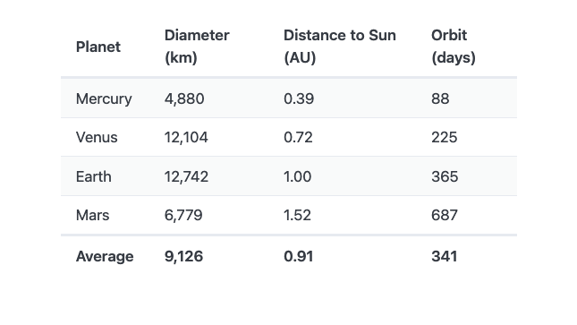
テーブル
<table class="striped">
  <thead>
    <tr>
      <th scope="col">Planet</th>
      <th scope="col">Diameter (km)</th>
      <th scope="col">Distance to Sun (AU)</th>
      <th scope="col">Orbit (days)</th>
    </tr>
  </thead>
  <tbody>
    <tr>
      <th scope="row">Mercury</th>
      <td>4,880</td>
      <td>0.39</td>
      <td>88</td>
    </tr>
    <tr>
      <th scope="row">Venus</th>
      <td>12,104</td>
      <td>0.72</td>
      <td>225</td>
    </tr>
    <tr>
      <th scope="row">Earth</th>
      <td>12,742</td>
      <td>1.00</td>
      <td>365</td>
    </tr>
    <tr>
      <th scope="row">Mars</th>
      <td>6,779</td>
      <td>1.52</td>
      <td>687</td>
    </tr>
  </tbody>
  <tfoot>
    <tr>
      <th scope="row">Average</th>
      <td>9,126</td>
      <td>0.91</td>
      <td>341</td>
    </tr>
  </tfoot>
</table>
横幅の長いテーブルは以下のようにすれば、溢れる場合に横スクロールバーが出ます。
<div class="overflow-auto">
<table>

</table>
</div>
次回、入力フォームについて見ていきます。